The first Apple logo was created by Ron Wayne. This name says little not only to ordinary people, but even to geeks. Meanwhile, Ronald is the third co-founder of Apple, and also the biggest loser of the 20th century. He sold his 10 percent stake in the company for $800 just 11 days after registration. If he had not taken this rash step, Ronald would now be one of the wealthiest people in the world with a fortune of $30 billion. Analysts say Apple's value will triple in three years, which means Wayne may have lost about $100 billion simply by not believing in Apple.
The logo created by Ronald Wayne has nothing in common with the current one. It was a miniature work of art. In the center was the outstanding English scientist Isaac Newton, on whom an apple was about to fall (insight!). In the future, the “Newton theme” will be continued when Apple releases its PDA.
If you enlarge the logo, you will notice that along the border there is the text: Newton... A Mind Forever Voyaging Through Strange Seas of Thought... Alone (Newton... A Mind that sails alone through strange seas of thought). This is a line from William Wordsworth's autobiographical poem "The Prelude", which in its entirety goes like this:
And from my pillow, looking forth by light
Of moon or favoring stars, I could be held
The antechapel where the statue stood
Of Newton with his prism and silent face,
The marble index of a mind for ever
Voyaging through strange seas of Thought, alone.
Translated it looks like this:
From my pillow, illuminated by the light
Moon and good stars, I could see
On the pedestal is a statue of Newton.
He is holding a prism. Quiet face
Like the dial of a mind that's alone
Sailing through strange seas of Thought.
 The logo turned out to be interesting (all these references to Newton, who really was lonely, a touch of mystery, etc.), but not very suitable for reality modern business. Therefore, Wayne's work was used for about a year. Then Steve Jobs turned to for help graphic designer Rob Janoff. It was necessary to create a simple, modern-looking, well-recognizable logo.
Rob completed this task in about a week. In an interview with the Revert to Saved blog, Yanov talked about how the logo was created. Rob bought apples, put them in a bowl and began to draw, gradually removing unnecessary details. The famous “bite” was made on purpose: the logo had to be drawn so that it would be strongly associated with apples, and not other fruits/vegetables/berries. The similarity of the pronunciation byte/bite (byte/bite) also played into its favor.
![]()
Rob Yanov made the logo in color, which gave good soil for speculation and myth. The most common one, actively supported by Win and Linux users, comes down to the fact that the Apple symbol reflects support for sexual minorities. This is not entirely true. Apple truly supports the LGBT community, as evidenced by recent video, however, the color logo was created a year before gays began using the rainbow as a symbol.
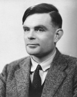 The second myth is even more interesting. They say that an apple painted in the colors of the rainbow is a kind of sign of respect to Alan Turing. Turing is an outstanding English mathematician and cryptographer who made a significant contribution to the fight against fascism. During World War II, he cracked the Kriegsmarine and Enigma ciphers, and after that he had a huge influence on computer science (Turing test, work on the theory of artificial intelligence). Turing's merits did not save him from prosecution for homosexuality. Alan faced two years in prison if he did not agree to hormone therapy (which, among other things, led to breast growth and chemical castration). In addition, Turing was deprived of his most valuable asset: the opportunity to do what he loved - cryptography. As a result, Alan became a recluse, and then completely committed suicide. Moreover, the form of suicide was very unusual: Turing bit off an apple, which he had previously pumped with cyanide.
Rob Yanov refutes both myths. According to him, there is no need to look secret meaning. Apple's color logo was intended to reflect the fact that the company produces computers with color monitors. The Mac display at that time could display six colors. These colors were precisely indicated on the logo. There is also no pattern in the arrangement of colors. Yanov placed the colors in random order, only green color was placed first intentionally.
The logo existed in this form for 22 years. In 1998, Steve Jobs, who had previously been ousted from Apple, returned to the company. Apple was experiencing enormous financial difficulties. Competitors sarcastically advised to close the shop and distribute the money to shareholders. Drastic measures were needed. And do you know what pulled Apple out of the crisis? Industrial designer Jonathan Ive has come up with a new case for the iMac G3.

![]() Computers that look like candy canes literally saved Apple. Moreover, they became iconic - their images appeared in films, TV series, and glossy magazines. It is clear that a colorful logo on a colored poppy would look stupid. Apple has moved away from using a color logo. So, since 1998, we have seen a laconic monochrome logo. The company has matured. And with her, so do we.
Computers that look like candy canes literally saved Apple. Moreover, they became iconic - their images appeared in films, TV series, and glossy magazines. It is clear that a colorful logo on a colored poppy would look stupid. Apple has moved away from using a color logo. So, since 1998, we have seen a laconic monochrome logo. The company has matured. And with her, so do we.
Rob Janow created an outstanding logo. This is not a banal insignia, but a real Symbol. But Yanov’s achievements were not particularly noted by Apple. At the beginning of the note I mentioned Nike logo. It was created by Carolyn Davidson, a student and freelancer from Oregon. Nike, a young company at the time, paid $35 for the work. But ten years later, the company’s founder, Phillip Knight, presented her with an expensive ring with a diamond “stroke” - the signature style, as well as an envelope with company shares. Knight appreciated the designer's work, making her a co-owner of Nike (albeit with a small stake).
In our turbulent times, people do not have enough time to sleep, let alone remember all sorts of things. different brands. However, even in such conditions, there are several logos that almost every inhabitant of the Earth knows. For example, you can recall the ideal Mercedes star, the well-known Coca Cola inscription, the outline of the Nike symbol, the white and blue circle of BMW. Among these leaders we can highlight the Apple logo. Many people often wonder about the history of the origin of the Apple logo, and how it has changed over the decades.When did the Apple logo appear?
Apple owes its first logo to Ron Wayne. Now the name of this man has almost been forgotten and it is unlikely that people well versed in the history of Apple remember him. Although this man was the third co-founder of the tiny Apple company. But no one remembers him for a very simple reason, this loser, what else can you call a person who got rid of the shares of a young company just 11 days after its founding. He sold them for $800. Imagine how much money he would have now. After all, he had 10 percent of the shares, and in modern times this is a cosmic amount. The symbol that Wayne came up with for his company has nothing in common with the current emblem. It was a carefully designed picture in which Isaac Newton occupied the main place, with an apple on top, symbolizing insight. Much later, Apple will remember Newton when it begins to develop the first PDAs.
On first Apple logo small words are written, if you look closely you can read " Newton… A Mind Forever Voyaging Through Strange Seas of Thought… Alone", which can be translated into Russian as " Newton...The mind always sails through many seas of thought...alone". This paragraph was borrowed from a fairly well-known poem in the West by William Wordsworth called “The Prelude.”
And indeed the symbol turned out to be very sensible. All these mysterious references to Isaac Newton gave the logo a certain air of mystery. However, this logo was very unsuitable for modern business. It is for this reason that a year after the company was founded Apple Steve Jobs decided to find a completely new symbol. So he went to a wonderful designer named Rob Janoff. Steve Jobs gave the task to create such an emblem so that it would look modern and at the same time be perfectly recognizable among many others like it.
 For a week, this graphic designer was completely occupied with the task at hand. Many years later, he was interviewed in which he revealed the secret of how he came up with this logo. Rob went to the store where he bought apples of various shades, then he put them in a vase and began to draw. Gradually removing various elements. He drew that very bite quite deliberately, because his task was to depict such an image of the fruit so that it would be firmly associated with an apple, and not, say, with berries, vegetables or fruits. Moreover, in English language the word byte and bite off are written almost identically (byte/bite), this added even more meaning.
Myths of the appearance of the Apple logo
The first legend. Rob depicted the company logo with rainbow colors. Subsequently, many people began to slander that this coloring was somehow very similar to the symbolism of gay minorities, and, speaking in Russian, to the symbolism of homosexuals. Although this is fundamentally wrong, because that famous emblem began to be used on whole year before the buggers invented their rainbow logo. Second legend. It is believed that the apple painted in rainbow colors is a kind of tribute to A. Turing. This man is famous for being able to hack Enigma and Kriegsmarine code, and after the war had a strong influence on the development information technologies. For example, he came up with a special intelligence test, which later became known as Turing test.
However, there were some buggers here too. In the West, there is no escape from this, total pederasty. So, it turns out that Turing was gay and the authorities began to persecute him for homosexuality, and a not very bright future awaited him. After all, serving two years in prison, where every prisoner knows about your inclinations, is not very similar to a walk through a flowery meadow. As a result, he was forced to undergo a course of hormone therapy, as a result of which many women develop breasts and experience infertility. Moreover, the tolerant authorities forbade this talented pederast to do his favorite thing. No in in this case I mean, not love games with men, but cryptography.
This was a cruel blow to the fragile and tender soul of the gay scientist. As a result of mental anguish, he committed suicide some time later. Yes, being a homosexual in the West is a thankless task, and sometimes even dangerous for the psyche. What does an apple have to do with it, you ask? The thing is that Turing decided to leave this life that was disgusting to him in an unusual way. After all, homosexuals are creative people. So he bought an apple at the store and injected it with lethal dose potassium cyanide, after which he took a bite of it with gusto. However, alas, he did not have time to chew this juicy piece.
However, Rob Yanov has his own opinion on these legends. He believes that there is no double bottom in the Apple logo. The company's rainbow symbol was supposed to represent the fact that their company is engaged in the development and production of computers, and specifically with color monitors. At that blessed time, the Mac computer screen had the ability to transmit six shades. It was these colors that were included in Apple logo. Moreover, all the shades were installed in random order, and only the green color was specially placed first by Rob.
This rainbow logo has existed for twenty-two years.. After the “prodigal son” Steve Jobs returned to the company in 1998, who had previously been expelled in disgrace, positive changes began. In those distant times this corporation had very big problems With in cash. Most of Apple's competitors slept and saw that this company was about to go down. In order to survive it was necessary to radically change the company's policy.
And you ask, what miracle helped bring the dying company back to life? And everyone was saved by a wonderful designer named Jonathan Ive. He created the latest case for the brand new IMAC G3.
 This Mac pulled Apple out of the financial abyss and opened new horizons for it. Moreover, from that moment on, this company was noticed in the very high level, its logo began to be used in glossy magazines, TV series and films.
It became clear that the "rainbow apple" logo would look very strange on the Macintosh g3. Therefore, reluctantly, the company’s managers decided to rebrand and make new design. Therefore, starting in 1998, instead of the color “bitten apple” emblem, a monochrome logo appeared. So the company crossed the threshold childhood and has become mature and strong, and it seems that nothing can shake her unshakable confidence, except perhaps the “Financial Apocalypse”.
Evolution Apple logo
The first Apple logo was created by Ron Wayne. This name says little not only to ordinary people, but even to geeks. Meanwhile, Ronald is the third co-founder of Apple, and also the biggest loser of the 20th century. He sold his 10 percent stake in the company for $800 just 11 days after registration. If he had not taken this rash step, Ronald would now be one of the wealthiest people in the world with a fortune of $30 billion. Analysts say Apple's value will triple in three years, which means Wayne may have lost about $100 billion simply by not believing in Apple.
The logo created by Ronald Wayne has nothing in common with the current one. It was a miniature work of art. In the center was the outstanding English scientist Isaac Newton, on whom an apple was about to fall (insight!). In the future, the “Newton theme” will be continued when Apple releases its PDA.
If you enlarge the logo, you will notice that along the border there is the text: Newton... A Mind Forever Voyaging Through Strange Seas of Thought... Alone (Newton... A Mind that sails alone through strange seas of thought). This is a line from William Wordsworth's autobiographical poem "The Prelude", which in its entirety goes like this:
And from my pillow, looking forth by light
Of moon or favoring stars, I could be held
The antechapel where the statue stood
Of Newton with his prism and silent face,
The marble index of a mind for ever
Voyaging through strange seas of Thought, alone.
Translated it looks like this:
From my pillow, illuminated by the light
I could see the moon and good stars
On the pedestal is a statue of Newton.
He is holding a prism. Quiet face
Like the dial of a mind that's alone
Sailing through strange seas of Thought.
The logo turned out to be interesting (all these references to Newton, who really was lonely, a touch of mystery, etc.), but not very suitable for the realities of modern business. Therefore, Wayne's work was used for about a year. Steve Jobs then turned to graphic designer Rob Janoff for help. It was necessary to create a simple, modern-looking, well-recognizable logo.
Rob completed this task in about a week. In an interview with the Revert to Saved blog, Yanov talked about how the logo was created. Rob bought apples, put them in a bowl and began to draw, gradually removing unnecessary details. The famous “bite” was made on purpose: the logo had to be drawn so that it would be strongly associated with apples, and not other fruits/vegetables/berries. The similarity of the pronunciation byte/bite (byte/bite) also played into its favor.
![]()
Rob Yanov made the logo in color, which provided good ground for speculation and myths. The most common one, actively supported by Win and Linux users, comes down to the fact that the Apple symbol reflects support for sexual minorities. This is not entirely true. Apple truly supports the LGBT community, as evidenced by recent video, however, the color logo was created a year before gays began using the rainbow as a symbol.
The second myth is even more interesting. They say that an apple painted in the colors of the rainbow is a kind of sign of respect to Alan Turing. Turing is an outstanding English mathematician and cryptographer who made a significant contribution to the fight against fascism. During World War II, he cracked the Kriegsmarine and Enigma ciphers, and after that he had a huge influence on computer science (Turing test, work on the theory of artificial intelligence). Turing's merits did not save him from prosecution for homosexuality. Alan faced two years in prison if he did not agree to hormone therapy (which, among other things, led to breast growth and chemical castration). In addition, Turing was deprived of his most valuable asset: the opportunity to do what he loved - cryptography. As a result, Alan became a recluse, and then completely committed suicide. Moreover, the form of suicide was very unusual: Turing bit off an apple, which he had previously pumped with cyanide.
Rob Yanov refutes both myths. According to him, there is no need to look for a secret meaning. Apple's color logo was intended to reflect the fact that the company produces computers with color monitors. The Mac display at that time could display six colors. These colors were precisely indicated on the logo. There is also no pattern in the arrangement of colors. Yanov placed the colors in random order, only the green color was placed first intentionally.
The logo existed in this form for 22 years. In 1998, Steve Jobs, who had previously been ousted from Apple, returned to the company. Apple was experiencing huge financial problems at the time. Competitors sarcastically advised to close the shop and distribute the money to shareholders. Drastic measures were needed. And do you know what pulled Apple out of the crisis? Industrial designer Jonathan Ive has come up with a new case for the iMac G3.
![]() Computers that look like candy canes literally saved Apple. Moreover, they became iconic - their images appeared in films, TV series, and glossy magazines. It is clear that a colorful logo on a colored poppy would look stupid. Apple has moved away from using a color logo. So, since 1998, we have seen a laconic monochrome logo. The company has matured. And with her, so do we.
Computers that look like candy canes literally saved Apple. Moreover, they became iconic - their images appeared in films, TV series, and glossy magazines. It is clear that a colorful logo on a colored poppy would look stupid. Apple has moved away from using a color logo. So, since 1998, we have seen a laconic monochrome logo. The company has matured. And with her, so do we.
Rob Janow created an outstanding logo. This is not a banal insignia, but a real Symbol. But Yanov’s achievements were not particularly noted by Apple. At the beginning of this post I mentioned the Nike logo. It was created by Carolyn Davidson, a student and freelancer from Oregon. Nike, a young company at the time, paid $35 for the work. But ten years later, the company’s founder, Phillip Knight, presented her with an expensive ring with a diamond “stroke” - the signature style, as well as an envelope with company shares. Knight appreciated the designer's work, making her a co-owner of Nike (albeit with a small stake).
The Apple logo, in the form of the well-known bitten apple, has a rather fascinating history. But just three decades ago, no one knew about him. Now let's talk about this story.
In 1976, two young men decided to register their company under the name “Apple Computers”. And the names of these young people were Steve Wozniak and Steve Jobs, then the guys themselves could not even imagine that after going through all the tests, they would be able to become the owners of the most popular company on the planet. In those distant times, they simply sat in their garage and did what they loved. Their first creation was a computer based on the Mos Technology 6502 processor. It was then that the first rudiments of the logo appeared.

True, at that time, the logo was an unattractive drawing of the physicist and mathematician Newton, who was sitting under a tree with an apple dangling above him. Steve Jobs almost immediately realized that with such a logo “you can’t cook porridge”, and ordered its design from Regis McKenna. One of the studio's designers, Rob Yanov, responded to Jobs' request and created the well-known apple. 
Although they say that due to the closed source code there are no viruses for Mac OS and iOS, viruses still make their way onto Apple laptops. And if suddenly you need to remove a banner from your desktop, we recommend turning to professionals rather than doing it on your own. 
The designer's idea was not to simply depict an apple, but to give the logo a deep meaning. But no matter how hard he tried, it just didn’t work out, and then, completely desperate, the designer sat down in a chair and took a bite of an apple. And then he came up with the idea of creating a logo in the form of a bitten apple in black and white colors. But Steve Jobs insisted on a color image. As a result, Apple became a company with a brilliant logo. The apple remained colored until 1988, after which it became black and white.
Few people know, but the photo above is the real Apple logo.
Apple's main symbol has been updated several times already. Changing the logo is a kind of control point, marking a transition to new views and principles of the company. Moreover, these changes were never random.
Are you sure you remember the old company logos? Let's figure it out.
Newton logo (1976 - 1977)
The first Apple logo is far from the modern, laconic symbol. By and large, he stood out in those days. The logo was created by one of the founders of Apple, Ronald Wayne, who quickly sold his stake in the company. It's a cool idea - to use the widely circulated story about the discovery of gravity by Isaac Newton. But its implementation leaves much to be desired.
Minimalism? No, we haven't heard. The logo looks more like a coat of arms: a shield, a heraldic ribbon, a pompous signature. It is absolutely not suitable for application to products, and all because of its bulky geometry and the abundance of small parts. Fortunately, it didn't last long.
Rainbow Logo (1977 - 1998)

An ambitious company needs a recognizable symbol. That is why Apple founders turned to designer Rob Janoff from Regis McKenna. It was he who created the well-known bitten apple in rainbow colors.
In an interview, the designer said that he simply bought a bag of apples and experimented with them for a week. Many hoax fans like to attribute hidden meanings to this logo. But Rob Janoff debunked all the myths, according to him, he did not make any references to Alan Turing or the Garden of Eden:
- stripes of all the colors of the rainbow speak of competitive advantage Apple computers that could display color images;
- the incorrect order of these colors is justified by the fact that the leaf of an apple should be green;
- the fruit was “bitten” so as not to confuse the apple with other fruits;
- the consonant “byte” and “bite” remain only curious coincidences.
Monochrome logo (1998–present)

By the end of the nineties, Apple was on the verge of failure. After his return to the company, Steve Jobs made a splash - he closed unpromising projects, updated the staff and stopped renewing licenses for branded products. software. In order to forever disown the disastrous old course, the logo was also changed. From 1998 until now it has been a solid apple.
If the size of the previous logo rarely exceeded 1.5 x 1.5 cm, then the monochrome version is usually larger, brighter and more noticeable. Nowadays the “apple” is painted in three colors: black, white and gray. But before there were more varieties, here are the most famous:
iMac G3 logo

The release of the iMac G3 in 1998 marked the return of Apple. Stylish all-in-one PCs had just such a logo, and it was the same color as part of the case. The PowerMac, Apple Studio Display and iBook, released a year later, received similar logos.
“Aqua” logo

This logo first appeared on the PowerMac G4 Cube and was used for several years in advertising and banners. Plus he could be seen in earlier versions OS X, because the logo fit perfectly into the concept of the Aqua interface.
"Glass" logo

Users of Apple's desktop OS first saw this logo in 2002 when upgrading to OS X Panther. With the release of the iPhone in 2007, this symbol moved to mobile devices. It was replaced only in 2013 in connection with the release of iOS 7 and the abandonment of skeuomorphism.
Metal logo

Metal logos are one of Apple's favorite and recognizable features. Having appeared in the iMac G4 all-in-one PCs, such logos roamed across all categories Apple products. iPhone cases with holes? All for the sake of the treasured metal apple.
Logo “Product.RED”
Apple is partnering with Product Red to help the latter raise funds for the Global Fund to Fight AIDS, Tuberculosis and Malaria. On the official website of the Cupertino company you can find products, part of the proceeds from which go to this fund. Once a year, on the first of December, on World AIDS Day, Apple turns its logo red.
What's next?
Of course, Apple won't change the shape of its logo. Expect exotic company color solutions It’s also not worth it, minimalism is in fashion now. Perhaps soon we will see the familiar logo made from new materials. Maybe