There are such strange ones geographic Maps, which are deliberately made with distortions. Scientifically they are called anamorphoses. Anamorphoses differ from ordinary maps in that the sizes of the countries depicted on them are made proportional not to the real area of these countries, but to some other indicator. These distorted maps are built so that you can clearly see how almost any phenomenon is distributed among the countries of the world. Here, for example, is the number of inhabitants.
World population
(country areas are proportional to the number of inhabitants, 2011)
From this picture it is clear at first glance that the most populous countries in the world are China and India. But Russia is almost invisible here.
Forest
(country areas are proportional to the forest area in those countries, 2000)

The most forested countries in the world are Russia and Brazil.
Fresh water
(areas of countries are proportional to reserves fresh water in these countries, 2000)

The leading countries in terms of fresh water reserves are the same as those in terms of forest area. But only now Brazil is in first place, and Russia is in second.
Foreign tourists
(country areas are proportional to the number of foreign tourists, 2003)

Most tourists come to the countries Western Europe. Basically, these tourists are Europeans themselves.
Child labour
(country areas are proportional to the number of working children aged 10-14, 2005)

In many poor African and Asian countries, children must work to help feed their families.
Number of McDonald's cafes
(areas of countries are proportional to the number of McDonald's cafes, 2004)

The leader in the number of McDonald's is, of course, the USA. But unexpectedly there were a lot of them even in Japan.
Cinema visits
(country areas are proportional to the number of cinema visits in 1995-1999)

But here the leader is no longer America, but India. A huge number of films are shot in India every year. The plots of romantic Indian films are often very simple and similar to each other like twins, but nevertheless these films are very popular among viewers. Going to the movies for Indians has become almost national tradition.
Book publishing
(the areas of countries are proportional to the numberbooks,published in 1999)

Most books are published in Europe, but Russia is also quite noticeable in this anamorphosis compared to other countries.
Reading library books
(areas of countries are proportional to the number of books borrowed from libraries in 1999)

It’s not for nothing that our country is called the most reading country in the world. Keep it up!
And this is just a map of the world, without distortion. Looks unusual, doesn't it? :)

All anamorphoses are taken from the site.
Many people know that the geographic map of the world that we are accustomed to does not accurately reflect the real ratio of the areas of countries, and even more so of seas and oceans. The use of the Mercator projection leads to many distortions when, for example, Greenland looks larger than Australia... A fundamentally new projection proposed by Japanese designers made it possible to construct the most accurate map of the world that humanity has ever seen.
How did they do it?
Traditional world map being built the old fashioned way, in which the image from the surface of the globe is transferred to a flat map using the Mercator projection. As a result, we get Greenland on the map several times larger than Australia, while in reality Greenland is three times smaller...

But a map built according to the principles of the AuthaGraph projection can be called truly innovative! Here the proportions of land and water remain unchanged and correspond to what we see on the globe. For this development, AuthaGraph received a prestigious award - the Japanese Good Design Award.


Then comes the original process of transferring the image onto a plane by combining in various ways projection through intermediate objects. This "multi-layer display" reduces the number of errors and monstrous distortions that arise when traditionally unfolding the surface of a globe into a flat map.

Of course, it is impossible to achieve complete perfection, but the map from AuthaGraph comes as close as possible to it.


How do the authors of the new world map explain the need for its appearance?
“Antarctica was discovered in 1820, and the first man reached the North Pole in 1909. In the 20th century, relations between East and West and North-South problems came to the forefront of world politics. The main territorial interest was the land, which was the human habitat. But since the end of the twentieth century, dwindling resources and problems environment forced to pay attention to the polar regions and the territory of the oceans...
The AuthaGraphic World Map aims to support this new perspective and show what our globe actually looks like and the distribution of interests on it. various countries and groups."

According to its creators, the new world map will allow you to look at the planet and its individual corners from a new angle and free yourself from ingrained stereotypes like “Western World”, “ Far East", "go north."

For comparison: a world map drawn in 1844

World map of the 1490s, with the help of which Columbus convinced Ferdinand of Aragon and Isabella of Castile to support his expedition.

Have you ever thought about what actual sizes of countries different from those shown on geographical maps? In principle, such things would not be of any interest to a Soviet schoolchild, since all students knew about them, even with average academic performance.
However, in our time, the data presented in the article may shock some representatives of the new generation of youth.
So, the real sizes of countries and continents differ from what we see on maps. For example, looking at a map, you might think that Russia is significantly larger in size than the continent of Africa. In fact, Africa (≈ 30 million km²) is almost twice the size of Russia (≈ 17 million km²) in terms of territory.
Why does this depend? Maybe someone is deliberately trying to misinform us? No, friends. It's all about projection.
Remember this so that you can later use it in discussions with those who say that all geographical maps of the world lie, and they do this with insidious intent, because it is a conspiracy.
First, let's understand the basic principle of the most common projection. Read the next paragraph carefully and thoughtfully. If you wish, you can easily understand the logic of the process.
So, most of the maps familiar to us have a conformal cylindrical Mercator projection. The scale of this projection on the map is not constant, but increases from the equator to the poles.
In other words, the most realistic scale will relate to the equator, and the greatest distortions will be at the poles.
To grasp this information with the help of a visual picture, let's imagine a cylinder with a globe placed inside it. In this case, the planet touches the cylinder along the equator line.
Now, to project images of countries and continents onto a map, let's cut the surface of the cylinder along the prime meridian and unfold it as shown in the figure.

It must be said that this is the closest projection to reality, however, as we will now see, it also has serious distortions in the size of countries.
We repeat the rule: the further from the equator, the stronger the distortion and the larger the size of the territories appears. In this case, a classic example is the island of Greenland, which belongs to the Kingdom of Denmark (by the way, read it - you will be shocked).
The fact is that this island is located almost at the farthest distance from the equator, therefore, its size is greatly exaggerated, according to the Mercator map projection.
Let's see what the real size of Greenland is. To do this, simply transfer its contours to the equator, where the most accurate scale is displayed:


As you can see, on regular map it seems that Greenland is comparable in size to the continent South America. In fact, it is almost 9 times smaller than her.
Now let's look at Canada. Its real dimensions are also completely different than it appears on the map:


China is located relatively close to the equator, so its dimensions have not changed much:


The same goes for the USA. Their actual sizes do not differ much from the cartographic ones:


Territory area of Russia
But we are probably most interested in looking at the actual dimensions. It is important to emphasize here that this is a country in the world. Well, now to the numbers. The area of Russia is 17,125,191 km².
Canada is next in size. But even it is almost two times smaller than Russia. So no one can compete with the Russian land in terms of territorial area.
And, nevertheless, given its distance from the equator, we perceive the real scale somewhat differently. Here, in fact, are the projections themselves:


Pay attention to one interesting fact. On a regular map, it seems to us that Russia is significantly larger than the continent. Although when we transfer the contours of the country to the equator, it is clearly visible that the real size of Russia is almost half the size of Africa, as we already wrote about this at the beginning of the article.
And now we offer you a comparative picture of the five largest countries in the world. But, as an exception and for interest, immediately after Russia we placed fraternal Ukraine and native Belarus:

We offer, which within one minute will demonstrate to you what we wrote about above. Maybe after watching you will understand everything that you did not understand while reading.
If you liked these scientific facts about the real sizes of countries - share them in in social networks and subscribe in any convenient way.
Scientists to this day have not come to unanimous opinion, how to most correctly display the relief of a spherical planet on a flat sheet of paper. It's like drawing a map on a tangerine, peeling off the peel, and trying to flatten it into a rectangle. It is clear that the areas close to the “poles” will have to be greatly stretched.
The true size of Greenland
First, look at Greenland. Big island, isn't it? Almost like South America.
But when you move Greenland to the latitude of the United States, you can see that it is not that big at all. And when transferred to the equator, it is completely clear that this is just an island, and not a giant island.

But what would happen if Australia were at the latitude of Russia and Europe
Australia seems to be small in size. Firstly, it is close to the equator, and secondly, it is distant from other continents and has nothing to compare it with. But look at these cards.


Notice how Australia's shape changed as it moved north. This is because part of it is located beyond the Arctic Circle, that is, very close to the pole, and is greatly extended in the projection.
But the USA (without Alaska) compared to Australia. As it turned out, they are almost the same size
Mexico turns out to be a pretty big country.
And here real size the most mysterious continent - Antarctica
What about the true size of Russia?
Russia is not only the largest country, but also the northernmost. That is why on the map it looks like a giant, even larger than many continents.
But moving Russia to the equator, we will see that it has decreased by two or three times.
And this is how the size of Alaska gradually changes as it moves towards the equator
This is what China would look like if it northern country like Canada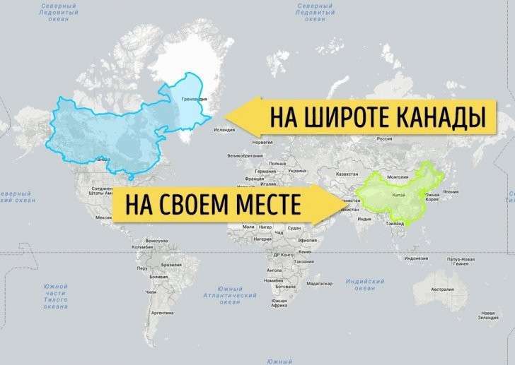
India, compared to Russia and the United States, is not as small as it seems
If the Democratic Republic of the Congo were in Europe, there would be almost no room left for other countries there
All countries on the African continent look somehow small. This is all due to the fact that they are located on the equator. See how the Republic of Congo covered almost half of the US and most of Europe.
The most large countries Africa at the latitude of Russia
Algeria, Democratic Republic of Congo, Sudan, Libya and Chad are quite large countries, but this is not usually visible due to their position. But in fact, if you put these five countries together, they will be almost the size of Russia in area.
Let's list the six most big countries along the equator. Now they are on an equal footing