Gone are the days when simple, monosyllabic colors were used to decorate interiors. Modern designers are constantly searching for interesting, original shades that can create a certain atmosphere. And one of original solutions refers to the olive color - a complex combination of several colors of green, yellow, gray and beige.
Psychologists assure that this natural tone on the wallpaper can give the room comfort, warmth, tranquility, and nobility. And design professionals have embraced this unique color because of its ability to create an elegant, understated interior and be combined with a variety of shades.
Today you can often find olive wallpaper, which is successfully used to decorate the walls of any room - living room, bedroom, kitchen, office. This versatility is another definite plus.

Features of olive wallpaper
If, when choosing wallpaper, the choice fell on olive, it’s worth getting to know the features of the palette better. Given certain points, everything can be extracted positive sides from gluing such wallpaper:

However, do not underestimate the palette of olive tones. They fit perfectly into modern styles, making the interior visually cozier, calmer, and more harmonious. Take a look at the photo below:


But for the design of a study, such a relaxing influence is not always appropriate. Here you should set priorities and find out whether you need peace and relaxation while working? If yes, then you can safely buy such wallpaper and create the basis for interior design, for example, as in the photo:

But if you need an atmosphere that helps you concentrate and concentrate on work, then you can choose olive, but its darker, “serious” colors for office design. The interior will be impressive and status-worthy:


Of course, here it is worth taking into account the material of the wallpaper, since a paper product will in any case be less wear-resistant than vinyl or non-woven material.
Combination with calm colors
As a true natural tone, olive goes well with all natural colors and can be used to create a harmonious interior. Moreover, such wallpapers are more often used in interiors with materials of a different color than on their own. Among the most successful combinations The following can be noted:
- with brown. The combination of two discreet colors creates a discreet, but at the same time, sophisticated atmosphere, as in the photo.
This combination is suitable for decorating a living room, study, bedroom, hallway. But it is important to consider that tight spaces will require an additional lighting source;
- with beige shades. Warm, gentle beige is an excellent companion for the olive color. This combination produces a very harmonious interior:
To decorate a room, it is advisable to hang various paintings, panels, and installations. Indoor plants also look beautiful and organic;

The design is light and modern;

However, there are some pitfalls in such a design, since two calm natural shades can make the room monotonous and boring. To prevent this from happening, designers suggest using different textured materials in the interior of one room - imitation or natural stone, wood, linen fabrics and more.

The interior will look more dynamic and interesting.
Contrasting combination
But not only calm colors suitable for tandem.
Olive wallpaper and red accessories create stylish design, warm in autumn, but not without richness and extravagance.


Muted reds - burgundy, lingonberry, rowan - are perfect for this design. Thick and rich, they are able to emphasize the depth of olive color.
Quite rare and original combination- Olive and orange and yellow wallpapers, which have a right to exist. However, experts recommend using muted warm yellow or orange if you want to get a harmonious, calm interior. In addition, they can create a wonderful trio with olive.
Warm shades create the same atmosphere and eliminate excessive severity and formality. White, brown, and beige accents will help complement the picture, giving the design idea a formal look:

A bright combination of olive and yellow-orange wallpaper is suitable for interiors in the style of romanticism and Provence. In this case, olive-colored wallpaper will somewhat reduce the dynamism of sunny, too hot shades.
Additional decor
The olive palette is rich in muted, inexpressive shades that are perfect for the background, but require the presence of additional decor. Products made of glass, metal, and wood will help make the interior more “alive” and bright:


Ethnic elements look great against the background of olive wallpaper - products made of birch bark, rattan, all kinds of ornaments and paintings.
When choosing olive wallpaper, you can use all shades of gold, silver, and bronze. Such elements of luxury will in no way spoil the modesty of this color.
Olive is not a demanding, capricious color, so when correct selection colors from this palette, based on the characteristics of the room and the level of illumination, you can “play out” almost any combination. You can successfully use bright accents in the interior, and the wallpaper can also have a dark, austere color. But in this case, it is recommended to dilute the dark colors with lighter accessories.
Striving for fashionable and interesting solutions In the interior design of an apartment, you can implement olive color as both the main and secondary shade of your room. Olive color- Quite calm and moderate. This is why you should take this into account when drawing up a sketch of the decor of your room.
One of important rules: You should not do the entire room in olive color, as the color will absorb light and the interior will be dark, dull and heavy.
To somehow brighten up the shade of olive color we need:
- Use brighter and lighter shades of decor.
- Try to choose the light so that your interior becomes elegant and fashionable
- Lighting close to sunlight is ideal, alternatively it could be a floor lamp.

Furniture color: olive
Dark furniture looks opposite (for example: black - white) against the background of olive walls, giving some solidity and elegance to your room. This style is suitable for lovers of classics and such trends as art deco.
Milky or beige (light) furniture enlivens olive walls and makes the interior cheerful and pleasant. Can be used both in the bedroom and in the living room and in different living areas.
Light wood furniture harmonizes cool with the olive background. This color combination is perfect for small apartments or rooms of any style where less attention is required.
Olive-colored facades are used extremely rarely, but they can be an excellent option for the design of a kitchen set.


Pros of olive color
- The white and olive interior is perfect for any room. The combination of these colors will harmonize and complement each other.
- Olive walls are a decorative element that looks great with or milky brown. However, to highlight these colors we will need furniture in dark colors.
- For those who like something non-standard, you can try a combination of colors such as pink and red, light green and blue.


Color in the interior - conclusion
Olive color can become a background different styles, while light and exclusive interior will give the required atmosphere.


Coloristics (the science that studies the properties of color) states that olive, as one of the natural shades of green, subconsciously evokes in people feelings of restrained freshness and slight coolness, peaceful calm and purity.
Choosing a style
This is one of the most versatile colors that can be confidently used to create any style. Olive cuisine can be subtly refined, expressively bright, and ultra-modern: you just need to use the intensity the desired shade and take into account coloristics.
Olive color will look perfect in the interior of a kitchen decorated in a cozy or sophisticated style. For a rustic style, choose soft, pastel shades.


Rich and rich colors in the company of shiny chrome accessories will become a colorful addition fashionable interior in high-tech style.

The combination of olive and beige can be successfully used both in a classic kitchen and indoors, with a design in a laconic and discreet style minimalism.

Solemn classic or empire style requires a contrast of olive with deep shades of brown (chocolate, coffee), which is usually emphasized with gold (fittings, lamps and/or embossing on wallpaper).
Wall color
If the kitchen walls have an olive tint, then it is better to choose the color of the furniture in light shades: white, beige, Ivory. Unpainted wooden facades are also suitable.


Even if the olive color of your furniture is diluted with contrasting color details (countertops, fittings, etc.), you should not make the walls in the same green-yellow color tone. An excess of soft green tones will act as a sedative and a sleep aid at the same time, and in such a kitchen you will always want to sleep, no matter how much coffee you drink.
Colors that can be used without restrictions for walls together with an olive set are white, soft cream, milky, light beige. Moreover, the brighter the olive, the more white there should be.


If your kitchen furniture decorated with a large number of decorative elements (carvings, accessories), and you do not want the interior to seem too pretentious, decorate the walls with a noble light gray color, which will add rigor and respectability to the interior.
If the windows face north or there is simply a lack of natural light in the room, feel free to use the colors of the solar spectrum for the walls: yellow, orange, diluted red.
Floor
When choosing the color of the floors, be guided by the rule for creating a harmonious space: the color of the walls and furniture is considered the starting point, the ceiling is made lighter, and the floor is darker.
Flooring (laminate, linoleum) with an imitation of wood texture is convenient and practical, given the frequent cleaning in the kitchen, and will look very natural in tandem with light walls.


When choosing floor tiles, try to find a pattern that will match the color of at least two main shades of the interior. In a kitchen with walls decorated gray wallpaper, it will look very harmonious floor tiles with olive-gray ornament.


The tile can also be a single color, for example, matching the color of the countertop. In any case, do not forget that it must have a rough surface - this is a matter of daily safety.
Apron

An olive-colored kitchen can successfully “wear” either a calm monochromatic or a bright or even variegated apron. If you are going to make it olive, then let the shade be more intense than the main color of the furniture.

A contrasting apron will look great. But, to create a complete composition, it needs to be supported with additional accessories to match.

If you decide to lay out yours without a pattern, then bright, possibly contrasting, grout for the seams will help give it more individuality and expressiveness.

A tile with an image of olive branches can support the theme of the southern coast.

Tabletop
When choosing a countertop for the kitchen you need to approach special attention and even with some pickiness. After all, this is not only a decorative addition to the furniture set, but also working surface, which must withstand considerable loads and is easy to clean.
As for, surfaces that also have a “natural” color go well with olive color. Natural stone or noble wood species will look very harmonious, especially if a similar texture is repeated in some other interior elements.


Countertops in the color of coffee or chocolate, saffron or mustard, plum or eggplant look impressive. A matte surface will dull the visual perception of color, while a glossy surface will make the shade more saturated.
Textile
Imagine the most fashionable, stylish and modern kitchen without curtains, beautiful kitchen towels, potholders and other fabric items. Will it be cozy in such a kitchen? Of course not.
Not only do they protect us from bright sun and participate in the overall design multi-colored idea, but also create a cozy atmosphere, and sometimes can completely change the look of the room. Therefore, choosing original textiles is perhaps the most important thing after choosing furniture.


A set of white textiles will look very festive and bright in a warm olive interior: airy curtains, stylish tablecloth and napkins, original oven mitts and towels.
But, curtains can also serve as an independent contrasting color accent, complemented by small decorative details. Curtains of chocolate, mustard, cream or blueberry color go well with the color of olives.
Decor
In an olive kitchen, bright accents and splashes of color are a must. Colored dishes will look tasteful - plates, cups and kitchen accessories in fruit and vegetable colors: green, orange, tomato, raspberry, cranberry, etc.


If the interior is made in country or Provence style, then accessories in beige shades with the image of olives would be appropriate.


Provence style
Provence style is characterized by coziness, comfort and homely warmth. The kitchen decoration uses muted shades, as if faded in the bright sun.

Delicate olive fits perfectly into this color palette. It is enough to generously dilute it with white or milky, and you will get a cozy interior in the style of the French province.
It is better to choose furniture from natural wood. The original texture with a natural pattern, small cracks and chips will further emphasize the given style.

An olive-colored kitchen set will look impressive and beautiful against the background of white walls. They can be painted or covered with plain wallpaper.
If you use greenish tones in the decoration of the room, then to create a contrasting picture, the sets should be made white.

Grayish shades will also fit perfectly into this tandem, giving the interior expressiveness and naturalness.
On open shelves it will be possible to put beautiful dishes in greenish shades. If you love more practical solution, use glazed doors as facades.

The main thing is to stick to the imitation of antiquity. Olive-colored furniture with slightly cracked paint is ideal.
If you cannot find suitable antique interior items, you can use artificial aging.
When decorating modern interiors
IN modern interiors shades of green are quite common. They relax nervous system, fill the room with harmony, give it naturalness and naturalness.

Having chosen hi-tech or minimalism for yourself, you should initially abandon pretentiousness and an abundance of decor, as well as other accessories.

The real decoration here is the shine of the metal, which will be especially impressive on glossy facades.

For spacious kitchens, you can choose richer shades of olive. Gray can be used as an additional color. It will fit perfectly into modern interiors.
Proper lighting will help emphasize the sophistication and uniqueness of the design. Built-in spotlights are ideal for implementing such an idea.

Don't forget to use household appliances from an aesthetic point of view. By choosing black models with chrome elements, you can highlight modern interior solutions.
In a small kitchen
- this is not a sentence, it is simply necessary to approach its arrangement with all care and attention.

Green itself visually brings objects closer, which reduces the size of an already small room. The exception here is light shades of olive. Dark tones can be used as accent colors.
Correctly selected lighting will help to visually expand the walls and raise the ceilings. This is especially true for kitchens that are not located on the sunny side. Lamps can be placed both above the working and dining areas.

Olive can be used for almost any kitchen stylistic directions. For small rooms classic or minimalism would be worthy solutions.
It is better to place a light kitchen set along one wall. This will allow you to significantly save an already small area.

For a work apron, choose small tiles. As decoration, you can choose models that have an image of olives.
Wallpaper with unobtrusive floral patterns is perfect for decorating walls. Instead of heavy curtains, it is better to use light, airy curtains or roller blinds.
In a private house
For there is an order of magnitude more options design than for city apartments. For example, you can decorate it in the now fashionable eco-style.
It will be extremely difficult to implement it in a city apartment, but for country cottage it will be the most suitable.

Light olive color will fit perfectly into it. Dark shades can be used for background inclusions: arches, niches, accessories, decor.

If possible and willing, make large panoramic windows. Eco-style stands out from the general background with spaciousness and abundant lighting.

Olive-colored materials can be used to create a work apron and flooring. Light colors are suitable for furniture, both the set and the dining area.

Choosing decorative elements, take into account not only the color, but also the fact that each interior style is characterized by a certain geometry of objects: classic interiors prefer smooth, rounded shapes, high-tech and minimalist styles prefer rectilinear ones.
Hello, dear readers! Currently, it is fashionable to decorate the living room in some interesting, extraordinary colors, it could be fuchsia, sunny yellow, turquoise, coral, salmon, emerald, olive, etc. Our site will be constantly updated with relevant reviews, but today we would like to present to your attention the interior of the living room in olive color. This shade looks simply gorgeous, but at the same time it is quite insidious, because in a dark room it looks somewhat gloomy, so it is better to use it in rooms with good natural light or the “daylight” glow of lamps, chandeliers, sconces and other lamps. If you like the olive living room, then the photos below will help you decide on its future design.
Olive color - psychology.
Color therapists have long proven that olive color can calm, restrain angry impulses, and generally have a positive effect on the human nervous system. Therefore, you and your guests will be as comfortable as possible in such a room. People who prefer this tone are purposeful natures who firmly hold their chosen position. In addition, the color balances its fundamental shades - dark green, yellow or brown, each of which has its own positive qualities.


Olive living room photo
Combination of olive color with other shades.
The olive shade looks amazing with the following tones: chocolate, white, light beige, light green, brown, pale pink, light blue, dark gray with a blue undertone, black, muted orange. But with all this variety of accompanying shades, olive “loves” to dominate, that is, all the colors mentioned above should better act as complementary, rather than predominant. In addition, for lovers bright colors It will be interesting to know that a living room in olive color may well be complemented by a minimal amount of rich tones - red, pink, blue, fuchsia - these could be sofa cushions, floor vases, wall lamps and other decorative elements.


Olive living room photo
Decorating an olive living room.
We have already mentioned above that this color can visually darken rooms, so when using it there are two fundamental directions: thoughtful, excellent lighting of the room or the active use of accompanying white tones.
What does smart lighting mean? Firstly, large panoramic windows, secondly, voluminous ceiling chandeliers and many spotlights, i.e. You need to brighten the room as much as possible. With the point regarding the use of white tones, in general, everything is clear; if the walls are olive green, then the furniture, curtains or decorative elements can be light. Probably everyone knows about the ability white“push” the boundaries, but in the case of an olive living room it is still better to use it as an accompanying one; it can be present in the decoration of accessories, furniture, partially in the decoration of walls, as a highlight of certain areas.
Floor. The floor surface can be covered with beige laminate, light tiles, snow-white self-leveling flooring, and also covered with gray, beige or green carpet.
Walls. Most often, olive tone is used in wall decoration; besides, against its background, snow-white ceiling skirting boards. The walls can be covered with plain wallpaper, also textured or with ornaments - ornate patterns, floral prints or alternating stripes.
Ceiling. It is better to make the ceiling light, this way you can lighten the rich shade of the walls, which regarding materials - it could be drywall, stretch fabric or mirror ceiling tiles.


Olive living room furniture.
Living room in olive tones, with the main shade of the walls made in olive color, can be complemented by sofas and armchairs in the following colors: brown, black, beige, gray or white. If the walls are painted in a neutral beige tone, then the upholstered furniture should be olive or combined. Also, we must not forget about olive accessories: curtains, vases, pillows, picture frames, figurines, rugs, floor carpet, flower pots, floor lamps, wall lamps, ceiling chandeliers, wall shelves etc.


Green living room - design ideas:
In today’s review, we showed you what an olive living room should look like, looked at the accompanying shade palette, studied the psychology and characteristics of color, and also talked about the furniture and decorative part. We hope that the living room in olive color made a positive impression on you, leave your feedback in the comments. In addition, we would like to remind you that on the “Comfort in the Home” website you can subscribe to receive notifications about the release of new articles (you can subscribe through the form located in the sidebar). See you again!
Olive color in the interior of a living room, bedroom or hallway is quite rare, especially in city apartments. The problem is that it is difficult to find worthy companions for him, and in the evening the room becomes gloomy if there is no decent lighting. Although natural shade Southern fruit is considered warm, experts consider it “unfriendly”; not every designer can offer a spectacular, memorable project with a cozy atmosphere. However, it periodically comes into fashion. For those whose favorite color is the olive fruit, it will be interesting to experiment with the design of an apartment or one of the rooms.
Warm shades of olive tone in combination with other colors can fill a home with comfort and natural tranquility
When people talk about color classification, they usually think of the rainbow, with its “cold” and “warm” parts of the spectrum. And there are non-spectral tones - white, gray and black. But the list is not limited to this; there are also pastel, complex, mixed and transitional shades. Where, for example, should we include lilac and raspberry, beige and powdery shades? Each has its own characteristics, based on the properties of the colors from which it is composed.

Like all green shades, olive color has a beneficial effect on the human condition, helps to calm down and relax.
The same can be said about the olive color in the interior, consisting of a mixture of 3 components:
- gray;
- yellow;
- green.

Olive color combination
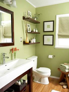
This natural tone needs to be applied thoughtfully and in doses. Especially if it is a base color or background in the form of painting walls or wallpaper in olive green. However, the blurred shade looks good in a Provencal-style hallway, in an “a la country” kitchen or a Japanese-style bathroom.
A rich color is obtained with a predominance of yellowness. It is great in textiles - bedspreads and bed linen, kitchen curtains and tablecloths.

In the bedroom it can be olive bed sheets or bed frame
Pale olive color with a predominance of gray with a silver tint - an excellent option for upholstery upholstered furniture And sofa covers. It is not easily soiled and looks good against the background of pearl-gray wallpaper, so it will be of interest to those who avoid white walls, bright colors and rich olive-colored wallpaper in the interior. The golden tint is even more luxurious.
This color with a predominant green base is no less interesting when they want to make a two-tone interior design - white and olive. This exquisite option is extremely rare, but in vain, the peaceful atmosphere and laconic duo looks great in eco-styles and Asian ethnics with a bamboo theme.

A vintage chair like this can be the highlight of your interior.
Designers successfully cope with the task of choosing the shades of this “visitor” of Mediterranean interiors. Beginners in this business should listen to their recommendations to get an exclusive, sophisticated interior in the shades of southern olive gardens.
- Green brings peace and naturalness to nature itself.
- Yellow color symbolizes warmth, comfort, positive emotions.
- Gray brings peace, focus and introspection.
Depending on the color saturation, proportion and lighting, the design of a living room or bedroom in olive tones may appear mustard, light green or green.

The photo shows how olive goes well with a marble floor, and white acts as a space divider into zones
Advice. If the interior turns out to be overloaded, do not rush to change the olive wallpaper in the interior. Experts recommend leaving the trim, but replacing the textiles, using a higher percentage of white. You may have to remove some of the bright accents, leaving an elegant duet with white and soft shades of wood texture.
Psychology of shade
Thanks to the yellow component, olive color is classified as a warm color, although it is a typical representative of the green palette. It is well received by those who are against green interiors in pure form, but agrees with such a rare and original proposal as an interior in olive tones.

Olive interior will set you up for work
This is the very personification of life, youth and health - this is how adherents of this color explain its perception. However, its related tones are shades of military or khaki (color military uniform), so to many he seems unfriendly and hostile. Perhaps, but this can only be said about dark shades of great saturation, which are rarely used in the color of wallpaper and interior textiles.
Some people associate it with maturity, prudence, and a certain touch of antiquity. Therefore, designers often use olive paint for antique furniture- buffets, chests, benches. This " welcome guest" V country houses and interiors of urban kitchens in retro style.

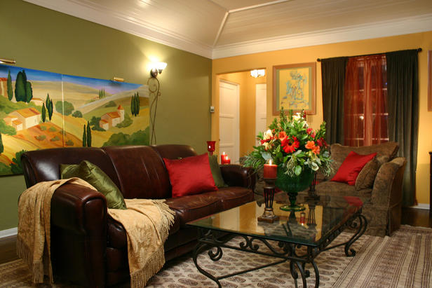
In a living room with pastel-colored walls, a spacious sofa with olive-colored fabric upholstery will look good
Saturated olive walls in the interior evoke thoughts and memories of bygone youth, but are conducive to introspection, which is why it is considered the “color of wisdom.” It is customary to dilute such interiors with more cheerful shades of youth - canary yellow and carrot.
No matter what, the inner feeling in such an interior is quite comfortable. Here you feel some kind of reliability, solidity, security, especially in combination with furniture made of natural wood light shades, as in the photo.
Advice. If you want to make new upholstery for old upholstered furniture, choose olive velor or flock with a silver tint without a pattern. The designers claim that this the best choice, emphasizing the exquisite nobility of antique classics.

In this room, olive chairs serve as a bright accent against the pastel-colored interior.
The natural olive tone carries a certain conservatism and confidence. Therefore, he is elected by calm, phlegmatic people, established in life, with conservative views. However, such people are distinguished by diplomacy and wisdom.
Similarly, the interior of the living room encourages unfamiliar people to have constructive conversations seeking compromises and mutual understanding. The design of an olive sofa in the interior for a meeting area is often chosen by the heads of large Japanese corporations.
Attention! Don't go overboard with your favorite color! A monochromatic olive interior is a little tiring, even if it is made in different shades. It will have to be diluted with well-chosen companions, including beige and white.
An experienced designer will not use something that causes disharmony - fuchsia or crimson. It is practically not used in the children's room - babies do not perceive this complex color.

Olive ceiling and light walls made this room wider
The percentage of shades in residential areas should be based on natural light. If this is a southern room, you can afford olive curtains; in a northern room it is better to abandon them altogether, replacing them with a light cream-colored veil.
Some people like contrasting combinations, others prefer a calm palette. And when organizing personal space, the atmosphere itself is more important, not just aesthetics. Remember this when choosing the aura that a new interior design will create.
Rules for using olive color in the interior
Before buying wallpaper or curtains, it is better to find out what olive color goes with in the interior. On the one hand, it is a natural color, on the other hand, it is difficult to quickly name best combinations or traditional companions. Its use in modern interiors has recently become in demand, but this color has not become popular - not every style finds a worthy application for it.

The combination of an olive wall with a soft cream ceiling in a spacious living room
Each color combination has its supporters and opponents. Juicy additions, bold contrasts and blurred backgrounds are the secret to a well-appointed living space. It is worth remembering the classic combinations with which color olive color is combined in the interior:
- beige;
- lactic;
- cream;
- mustard;
- pumpkin;
- carrot;
- brick or terracotta.

Striped living room interior
Important! The same color will be perceived differently in rooms of different styles, in designs with sharp contrasts. It is better to give preference to a range with soft color transitions rather than a sharp combination of olive color with white and black.

Olive shades are ideal for a classic style. There will be a harmonious combination with beige, pistachio and chocolate colors
Original combinations will add sophistication and dynamism to the room. You can use the following as emotional accents:
- sapphire and emerald;
- turquoise and blue watercolor;
- cognac and burgundy;
- lilac and lavender;
- orange and yellow saturated;
- indigo (blue-violet) and eggplant, but they need to be diluted with white.

Bedroom in olive tones with floral patterns on bedspreads, curtains and wallpaper
Note! The perception of design also depends on the fittings. Handles of doors and furniture facades can be golden and silver, copper and bronze, with blackening and ceramic inserts.
Popular combinations of olive color in individual rooms
- Olive with brown - it all depends on the shade, it is better to choose brown closer to chocolate, and take olive “young” or as if diluted with milk. You can add mustard, golden or yellow colors to this combination; it is advisable to increase artificial lighting, especially if this is a living room. Glossy surfaces will add reflected light.

Combination of olive and brown colors in living room design
- White can be yellowish and crystal clear, with a blue admixture, but it should not be used with the color of olive fruits. A milky or creamy shade will perfectly complement caramel accents, textiles and decor. An excellent combination for a living-dining room or kitchen. Stained glass inserts and broken tile mosaics will look great against this background.

Duet of white furniture with olive wall decoration
- Beige is a light alternative to brown and is therefore considered a good alternative. A welcoming combination in the hallway is with yellow accents; turquoise additions are suitable for the bedroom, but in a small percentage.

Olive-beige combination for a room in Provence style
- Light wood is an excellent companion for many shades of olive in the interior. This is a natural combination in country style, coming from the fields of Provence. Lavender and blue accents fit well into this option. An excellent combination for a kitchen-dining room with French chic.

Combination of olive shade with light wood
- Light green shades combined with carrot and olive are an excellent choice for the kitchen. This “ecological” combination increases appetite and improves mood.

Olive and contrast color
- In the zone business activity and the office looks elegant in olive with gray, silver and chrome fittings. Against this background, brown leather sofas in english style“chesterfield”, with a carriage-style low back that turns into armrests. The color of the upholstery can be varied - from cognac to chocolate.

Harmony of warm olive color on the wall with cool gray upholstery
- White, red and olive are a combination for the bedroom of a passionate couple, but white should predominate. Red can be replaced with wine-burgundy or lilac.

In the bedroom it is appropriate to use olive stripes against light walls
- For a hallway with a door directly to the street, a strict combination of gray and olive is suitable - a practical option where you do not need to deal with street dust every day. It’s just not advisable to choose textured plaster, but the photo wallpaper on accent wall will add charm and visually expand the space.

Olive color in the interior of the hallway
- Tile of this color is rarely on sale, but it is worth looking for it to decorate a bathroom in Japanese style. This warm tone will “warm up” cool blue-blue shades.

Kitchen apron tiles olive color
How to choose lighting
The color described has the property of absorbing luminous fluxes. And, as already noted, the olive color of the walls in the interior is good during the day and a little gloomy during artificial lighting. It is important to take this into account when planning the lighting design of a room with olive walls.
Depending on the chosen palette, artificial lamps of warm and cold light are selected. But in in this case a warm spectrum is needed, with the exception of the hallway in gray-green tones. Let us remember that matte surfaces absorb light, while glossy surfaces reflect light. If you use this principle, then the olive color in the interior will not seem gloomy.

Lighting in the kitchen in light olive shades
| 1. | General light | Ceiling chandelier, lampshade, large lampshade, LED strip around the perimeter of the ceiling. |
| 2. | Illumination of local zones | Table lamps, rotating indoor spotlights and shades, spots. |
| 3. | Spot light | Diodes multi-level ceilings, furniture lighting and zoning design. |
| 4. | Floor lamps | All kinds of floor lamps, interior luminous balls and cubes. |
| 5. | Illumination of vertical surfaces | Wall sconces, luminous objects (LED strip inscriptions, night lights), decorative lamps with perforation (patterns on the wall). |

The room seems a little dim and the light will be subdued, but this is quite suitable for a bedroom
Advice. As additional artificial lighting, aquariums and air bubble panels are recommended, which look great against the backdrop of “eco-friendly” olive walls.
For lovers of the olive palette, expert tips will help you create an inimitable interior in any room. See our photo examples to see which option is closer to you.
Video: possibilities of beneficial combinations in the interior